Logo Design
Branding & Visual Identity
Client
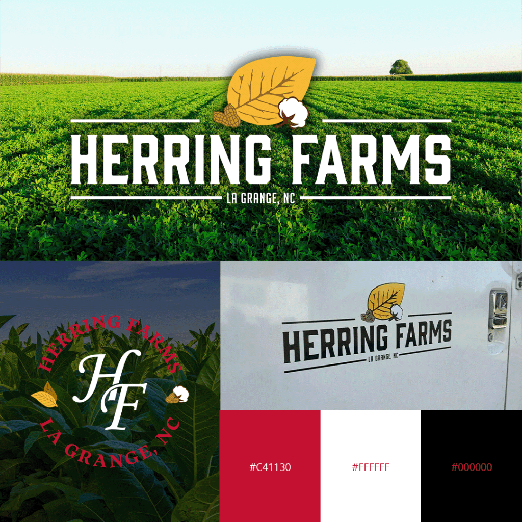
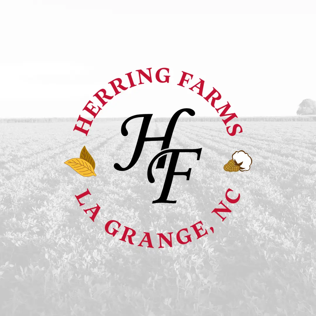
Herring Farms
The Project
For Herring Farms, we developed a visual identity that honors their deep agricultural heritage while establishing a fresh, contemporary presence. Located in La Grange, NC, the farm required a brand system that feels both grounded and timeless.
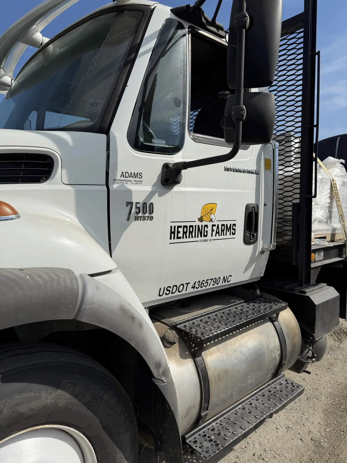
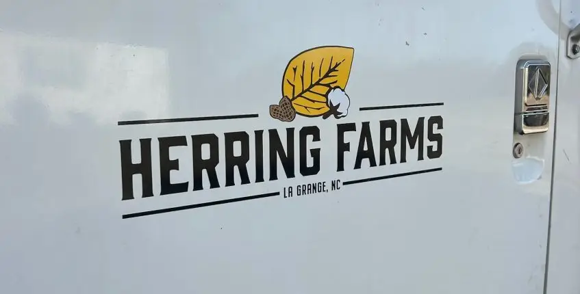
Our work focused on blending classic farm-inspired elements with clean lines and versatile formatting to ensure the brand transitions seamlessly from large-scale equipment and signage to high-end apparel and packaging.
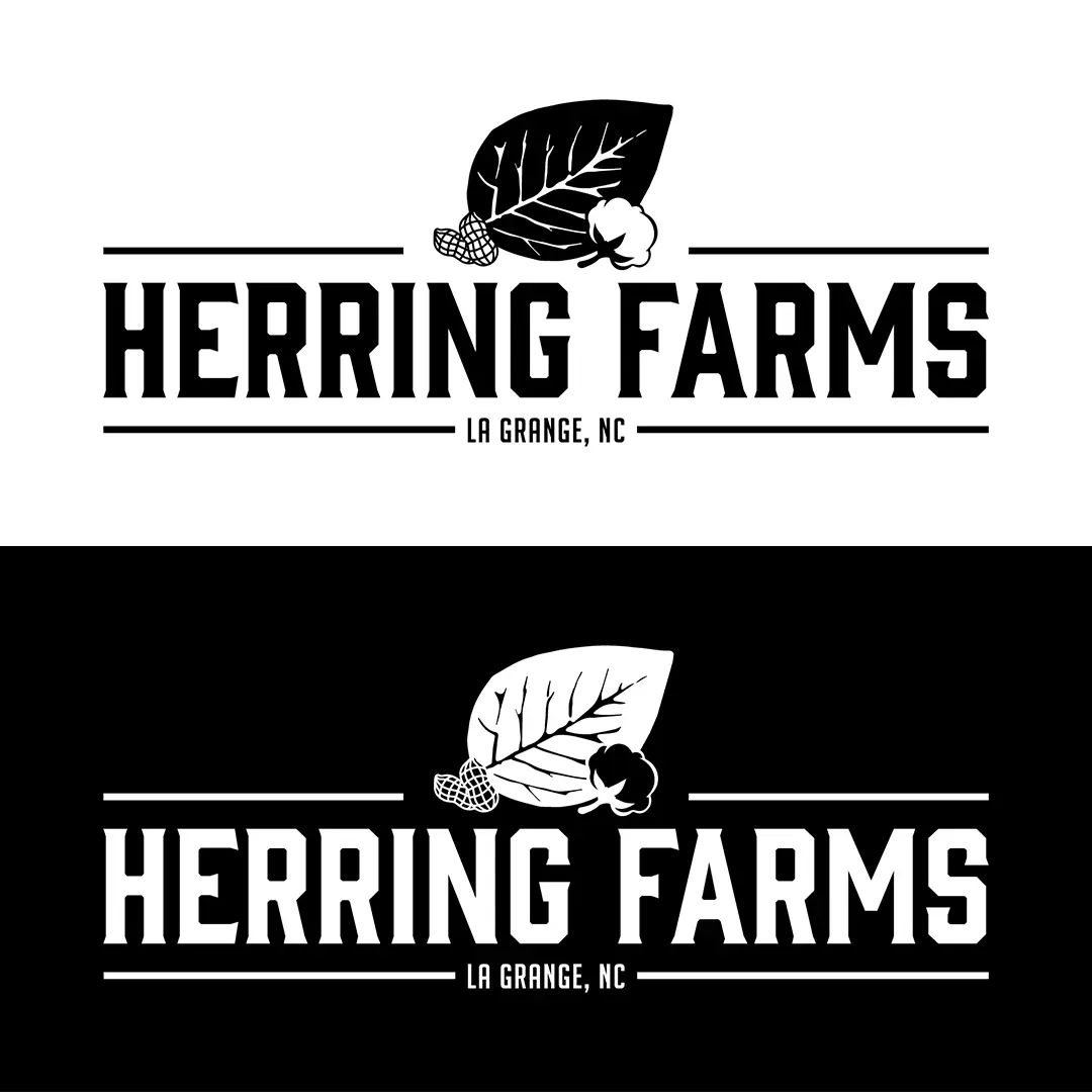
The Identity
Instead of a generic farm mark, we built an emblem that acts as a literal inventory of the farm’s output: tobacco, cotton, and peanuts. It’s an “all-in-one” mark that identifies exactly who they are and what they do at a single glance.
The typography is built for maximum visibility. We used the industrial, vintage-inspired weight of Gin for the primary wordmark to give it that “locker room” toughness. This is supported by the tall, condensed stance of BigNoodleTitling for location markers. For more personal applications, we paired the sturdy Maecenas with a classic Monotype Corsiva monogram, giving the brand a “hand-signed” touch that reflects the family’s personal pride in their work.
Brand Specifications
Main Logo Typeface: Gin – Regular
Location Marker Typeface: BigNoodleTitling – Regular
Alt Logo Typeface: Maecenas – Bold
Monogram Typeface: Monotype Corsiva – Regular
Color Palette:
Heritage Red: #C41130
Pristine White: #FFFFFF
Deep Black: #000000