Logo Design
Branding & Visual Identity
Client
River Ridge Realty: Land & Farms
The Project
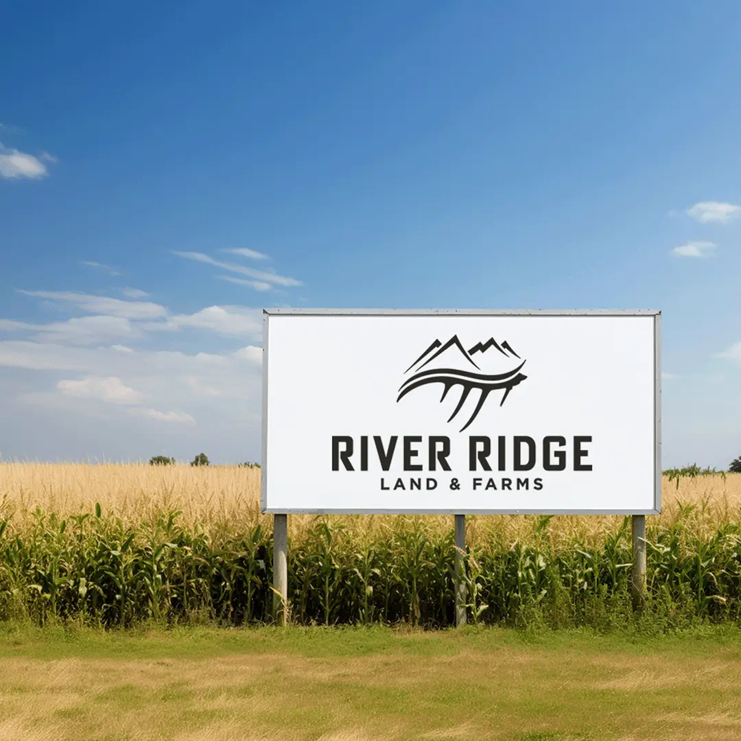
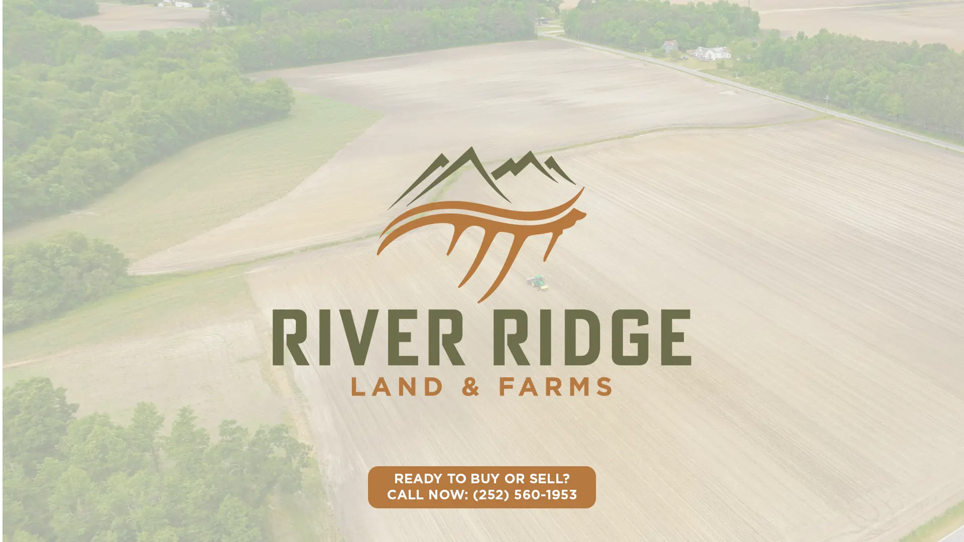
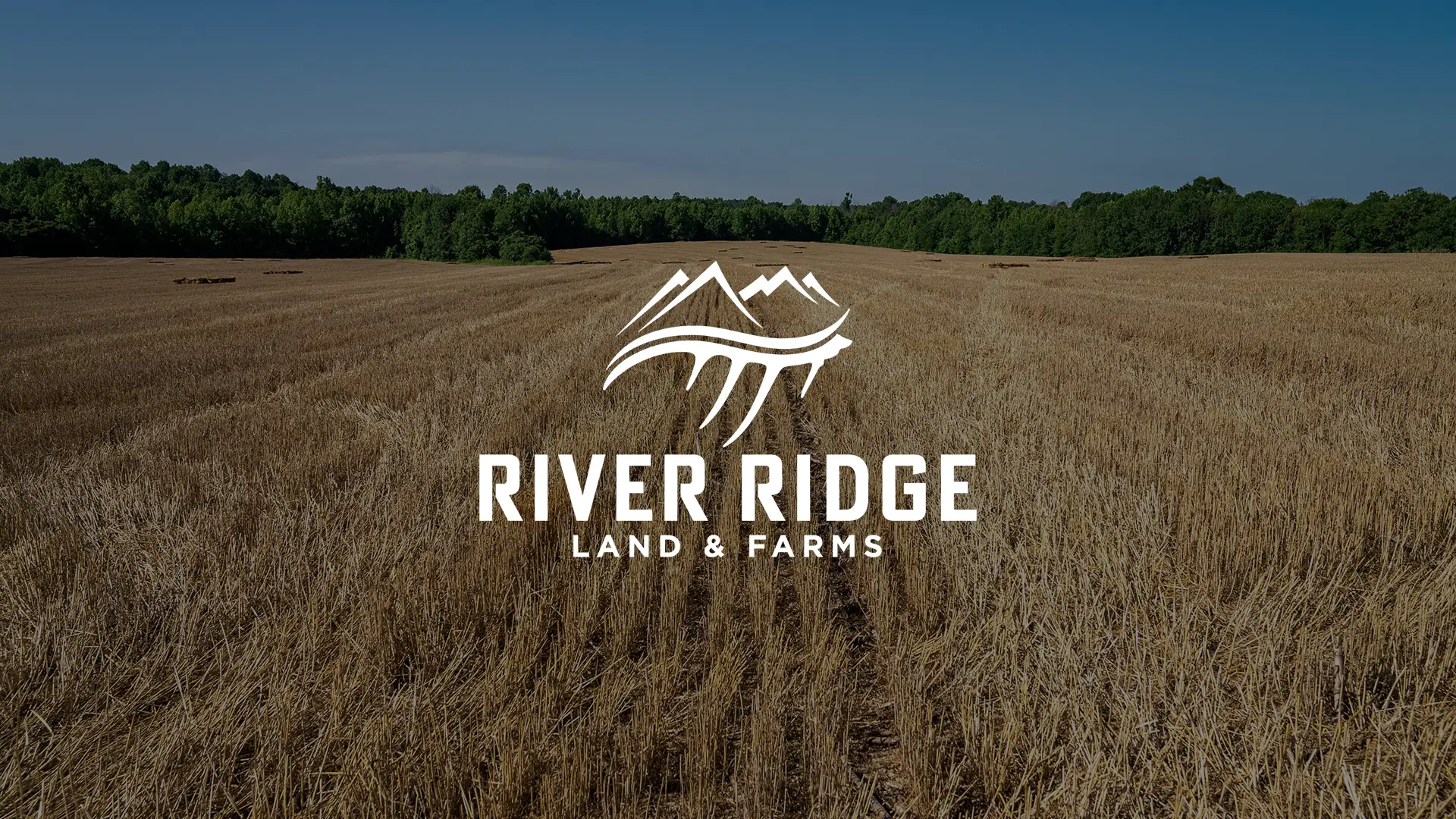
River Ridge Realty: Land & Farms was conceived as a distinct division to separate their rural listings from their established residential brand. They came to us with a specific vision for the icon, which we dialed in to bridge the gap between the two identities. The final system was engineered to be functional across everything from large-scale field signage to digital assets, giving the division a professional edge that stands out in a crowded industrial and rural market.
The Identity
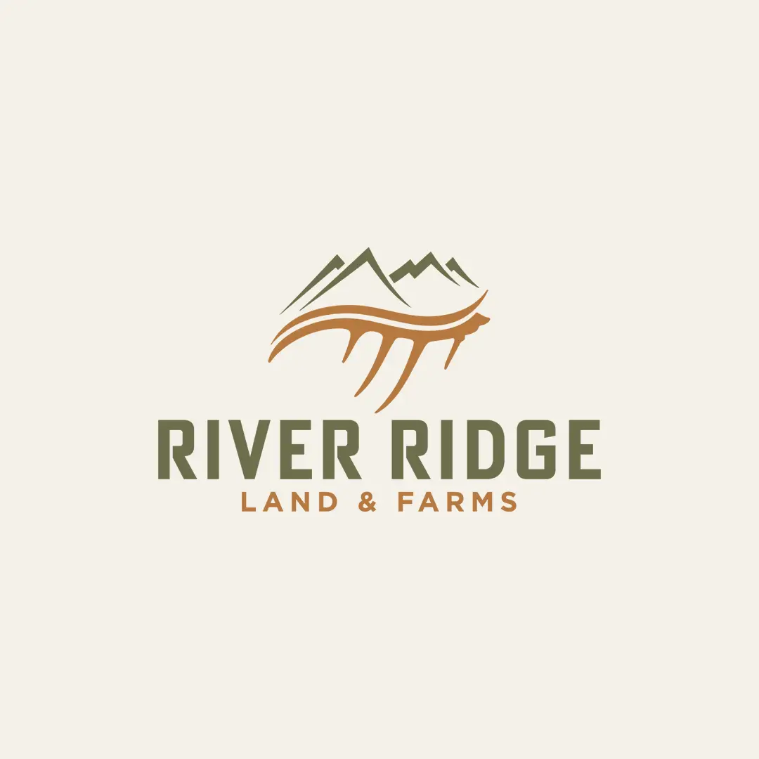
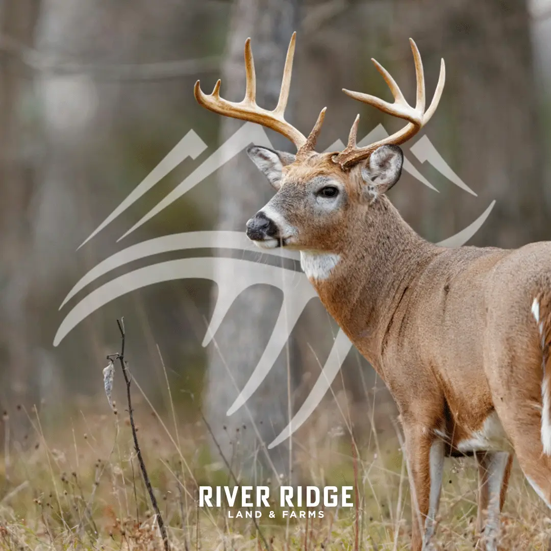
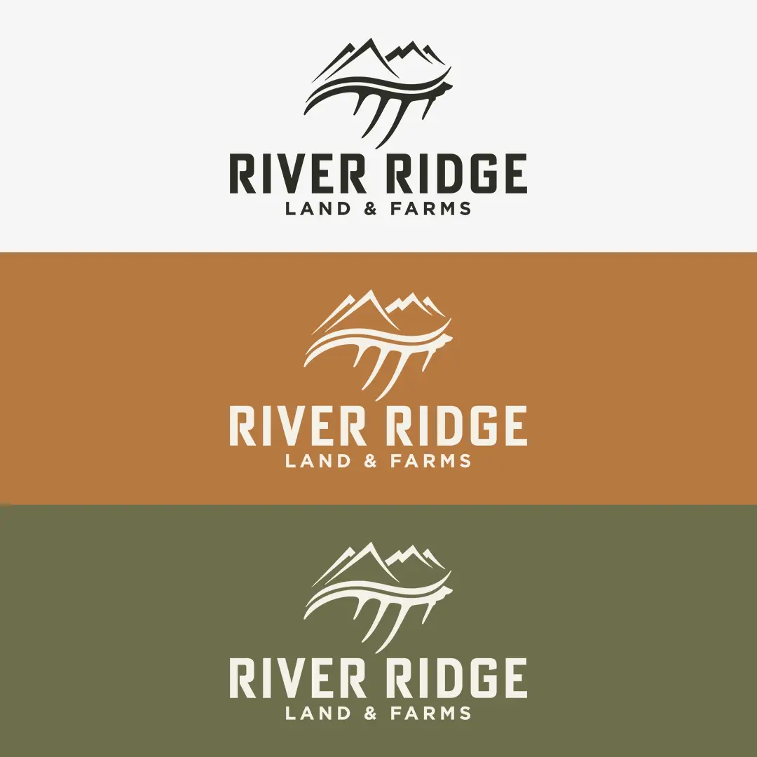
The logo features a custom emblem that integrates mountain ridges, a river, and a stylized antler to establish a clear visual language for the land and farm sector.
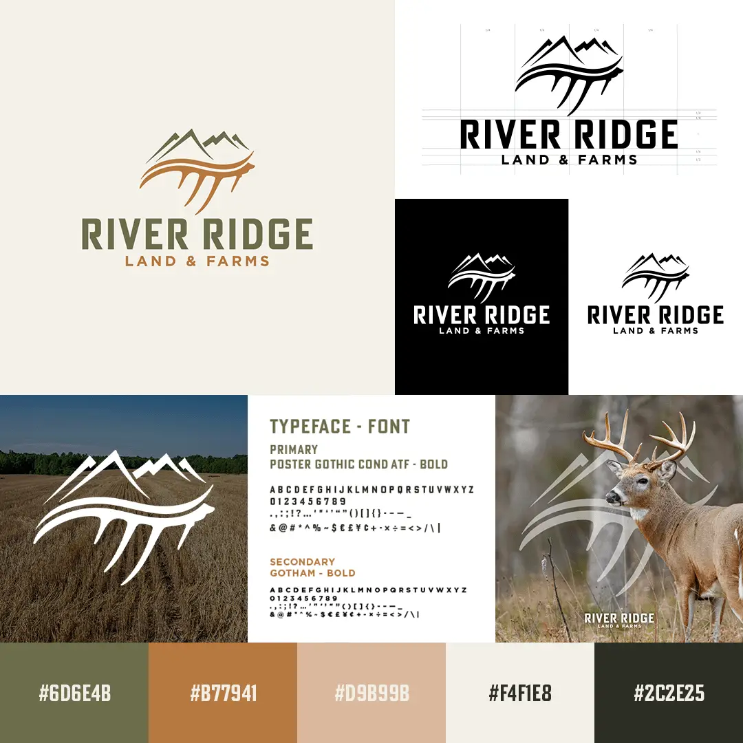
We used an antler-inspired mark to distinguish this division while keeping it anchored to the original River Ridge roots. To provide a grounded and powerful presence, we paired the mark with the heavy, architectural stance of Poster Gothic Cond ATF, supported by Gotham Bold for secondary details.
This system is finished with a natural, earthy palette designed for maximum visibility across physical equipment and digital platforms.
Brand Specifications
Primary Typeface: Poster Gothic Cond ATF – Bold
Secondary Typeface: Gotham – Bold
Color Palette:
Forest Sage: #6D6E4B
Bark Brown: #B77941
River Slate: #D9B998
Linen: #F4F1E8
Deep Earth: #2C2E25
