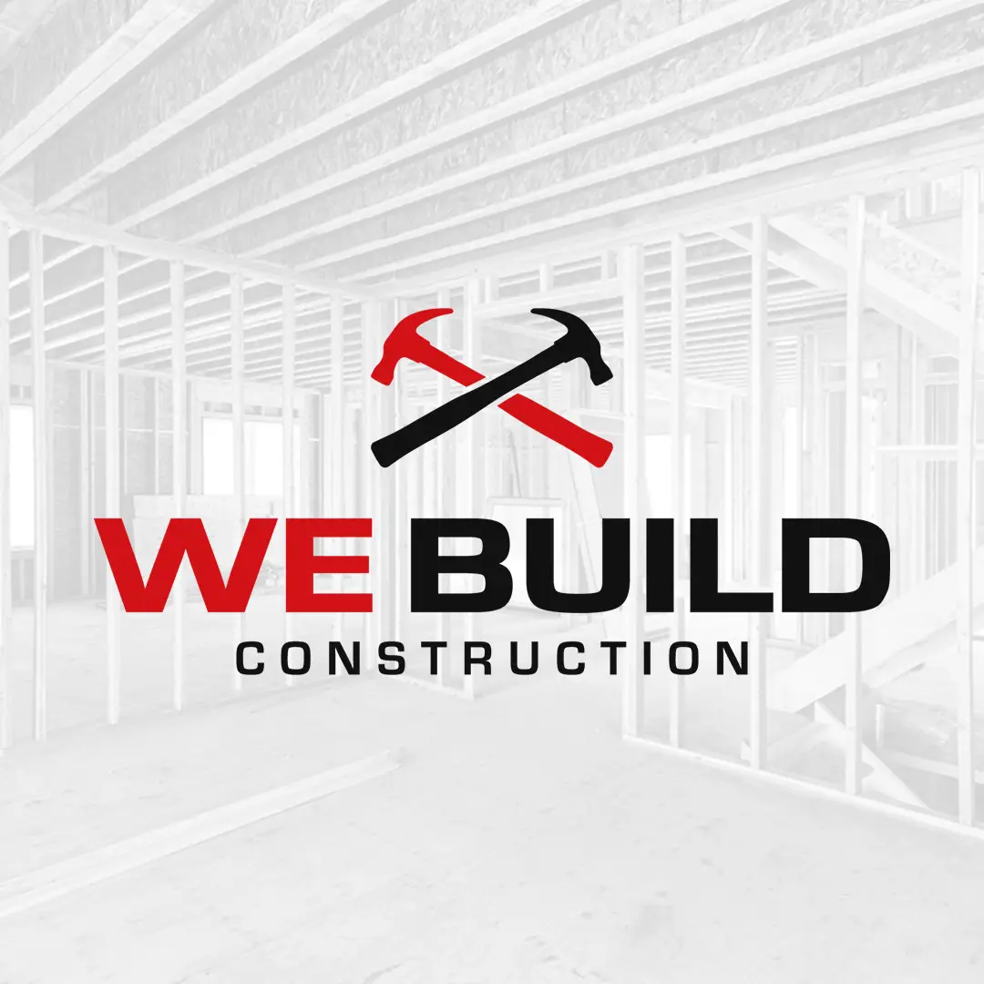
Logo Design
Branding & Visual Identity
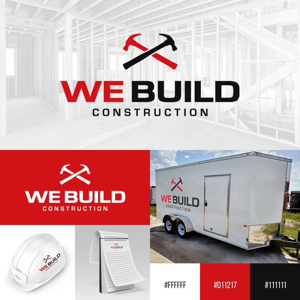
Client
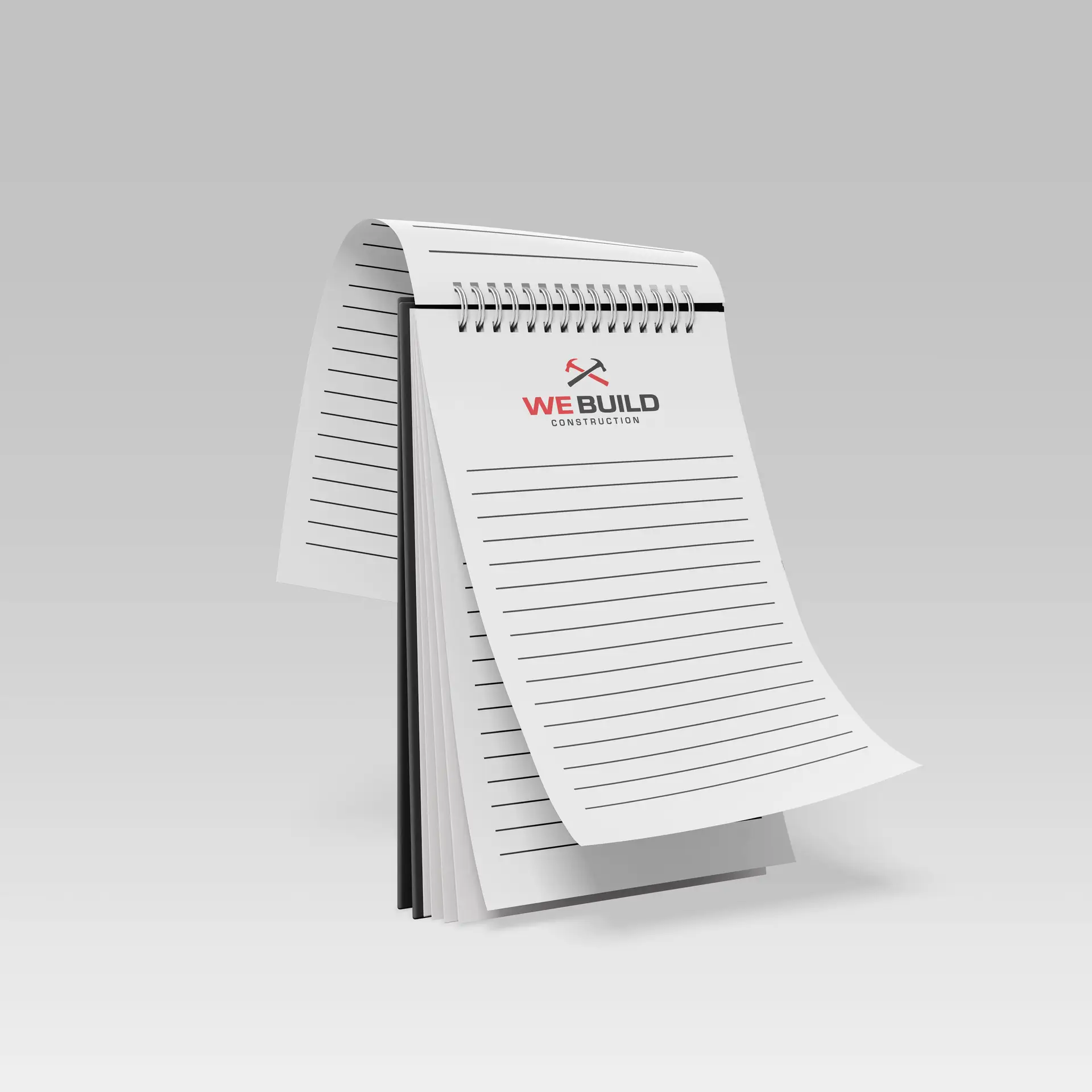
We Build Construction
The Project
We Build Construction required a brand transformation to match their status as a thriving builder in Eastern NC. We took a previously dated visual identity and overhauled it to reflect a more modern, innovative approach to the trade.
The result is a high-impact brand system designed for maximum visibility—ensuring the company looks as professional on a digital platform as it does on a job site trailer or safety gear.
The Identity
The goal was to build a brand that felt high-end and precise without losing its connection to the industrial sector. We wanted a look that felt as durable as the structures they build, mirroring the quality craftsmanship they provide.
We leaned into a bold, architectural style using MicroSquare Bold to give the logo a grounded, powerful presence. The wide, geometric stance of the typeface provides a sense of stability and structural integrity.
Brand Specifications
Main Typeface: MicroSquare Bold
Secondary Typeface: Technical Sans-Serif
Color Palette:
Builder Red: #D11217
Steel Black: #111111
Pristine White: #FFFFFF