Logo Design
Branding & Visual Identity
Client
GWK Applications Brand Identity
The Project
We created a sharp, high-impact visual identity for GWK Applications, an agricultural service provider in North Carolina.
The goal was to build a brand that stands out in a crowded industrial market while maintaining a professional edge.
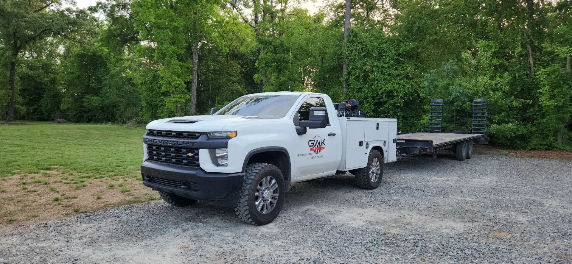
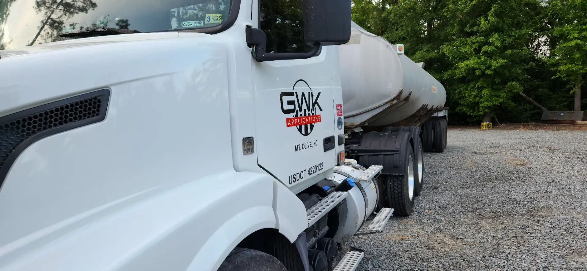
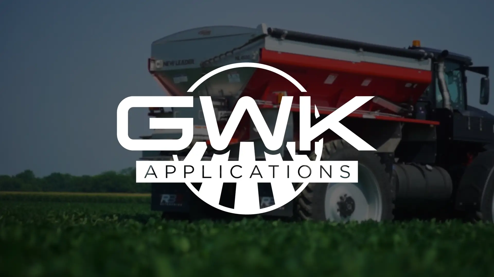
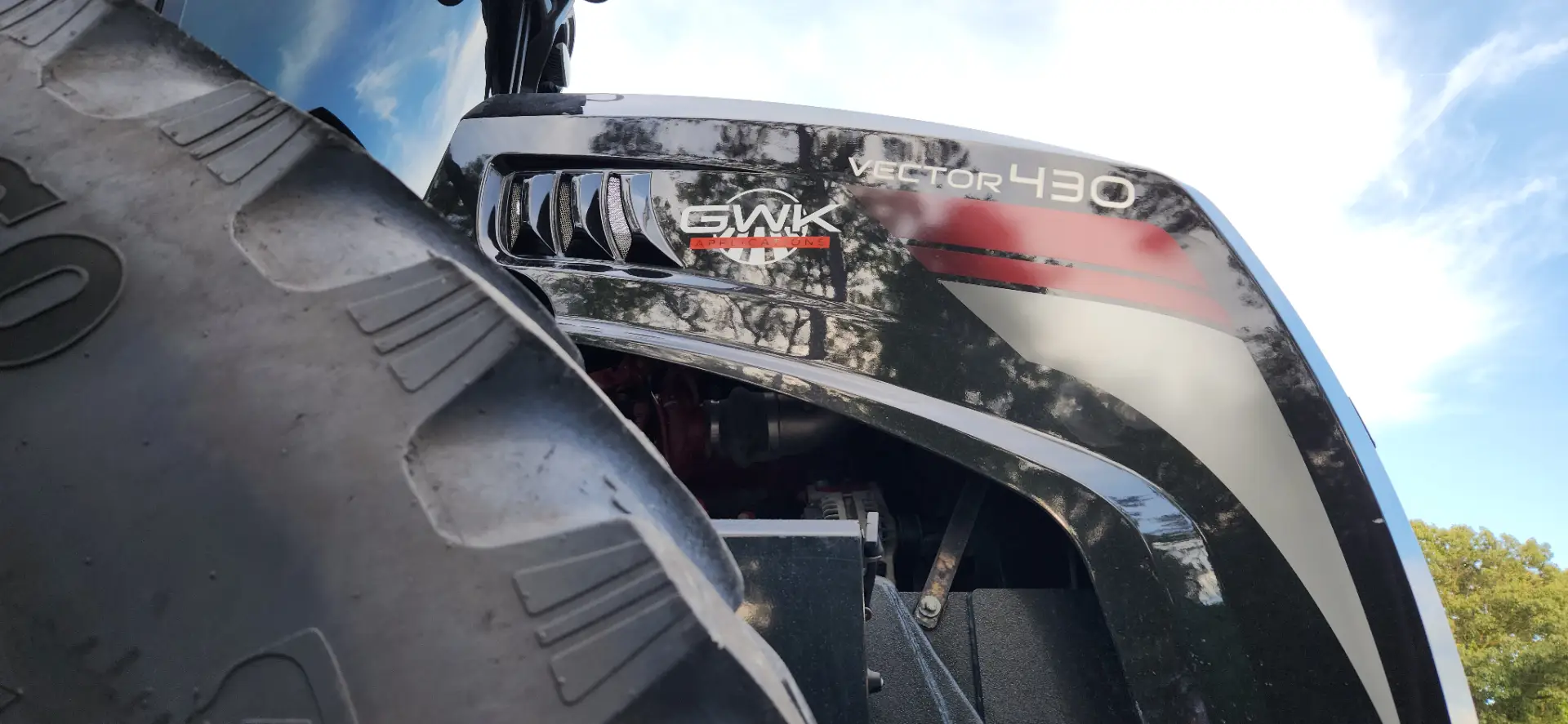
The resulting logo features a bold, custom wordmark and a subtle emblem that reflects the rows of the field, designed for maximum visibility across both digital platforms and physical equipment.
The Identity
The challenge was to build a brand that felt high-end and precise without losing its connection to the industry.
We leaned into an architectural style, using the wide, heavy stance of Tachyon to give the logo a grounded, powerful presence.
The circular icon provides a subtle nod to the agricultural landscape, incorporating field-row perspective into a clean frame, ensuring the brand remains industry-appropriate yet distinctively modern.
Brand Specifications
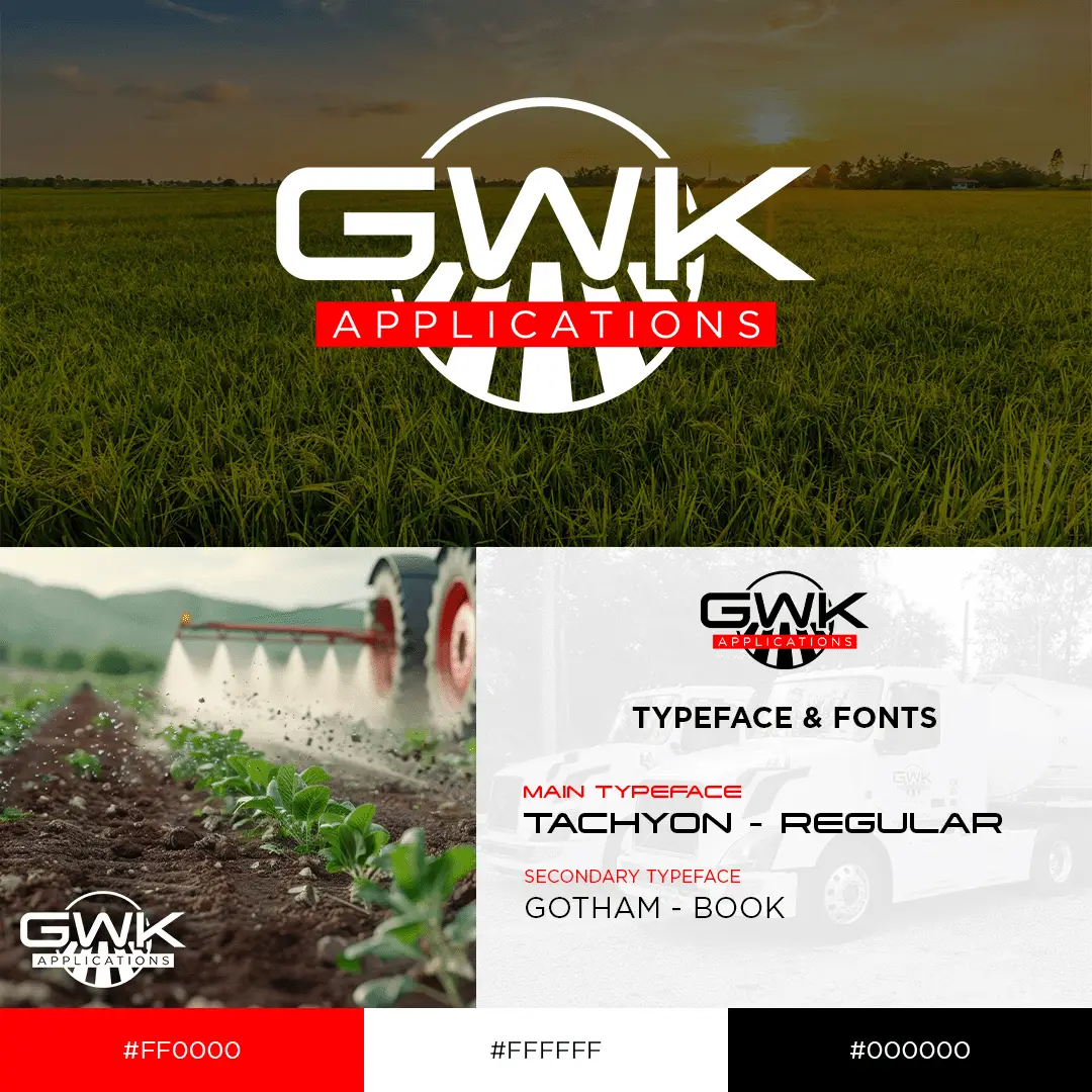
Main Typeface: Tachyon – Regular
Secondary Typeface: Gotham – Book
Color Palette:
Action Red: #FF0000
White: #FFFFFF
Black: #000000