Logo Design
Branding & Visual Identity
Client
Reel Tight Adventures Brand Identity
The Project
We redefined the visual identity for Reel Tight Adventures, a premier fishing charter operating out of Morehead City and New Bern, NC.
The project involved a complete logo revamp to create a fresh, dynamic look that captures the adventurous spirit of the brand. This updated design revitalizes their image, providing a visually captivating experience for fishing enthusiasts across all touchpoints.
The Identity
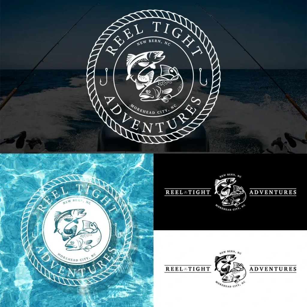
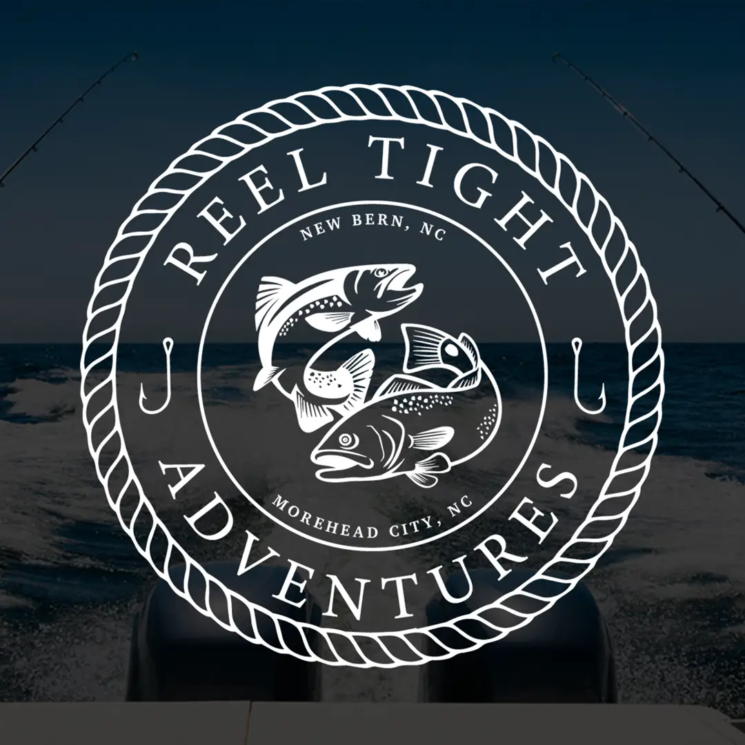
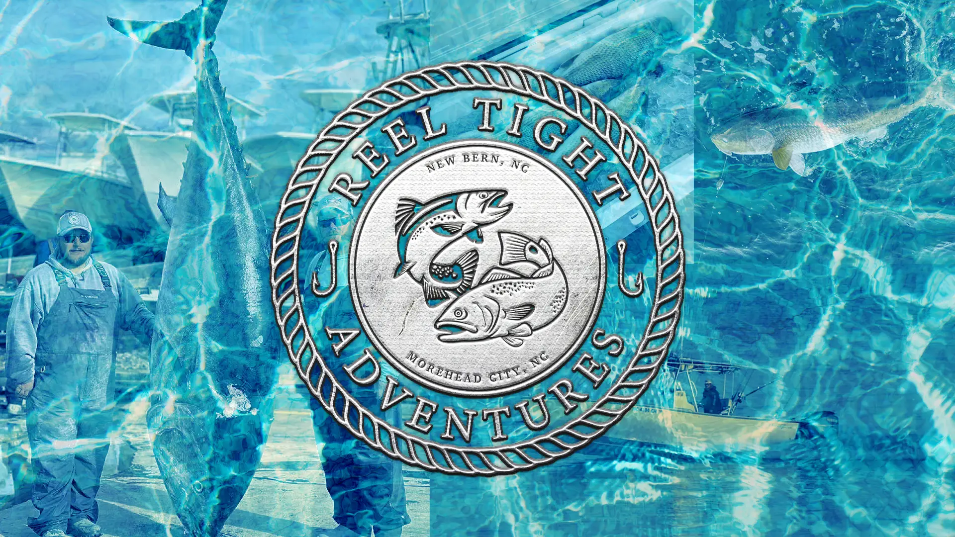
The logo is designed as a traditional nautical seal, utilizing a heavy rope border to frame the central imagery.
The core of the mark features detailed illustrations of local fish species, creating a direct connection to the charter’s primary services. Small hook icons and location markers for New Bern and Morehead City are integrated into the secondary ring to add technical detail while grounding the brand in its home coastal waters.
Brand Specifications
Primary Typeface: Charis SIL – Bold
Secondary Typeface: Minion Variable Concept – Regular
Color Palette:
Copper Gold: #E2923A
Ocean Grey: #7A7A7A
Black & White: #000000, #FFFFFF