Logo Design
Branding & Visual Identity
Client
The Beer Barn Brand Identity
The Project
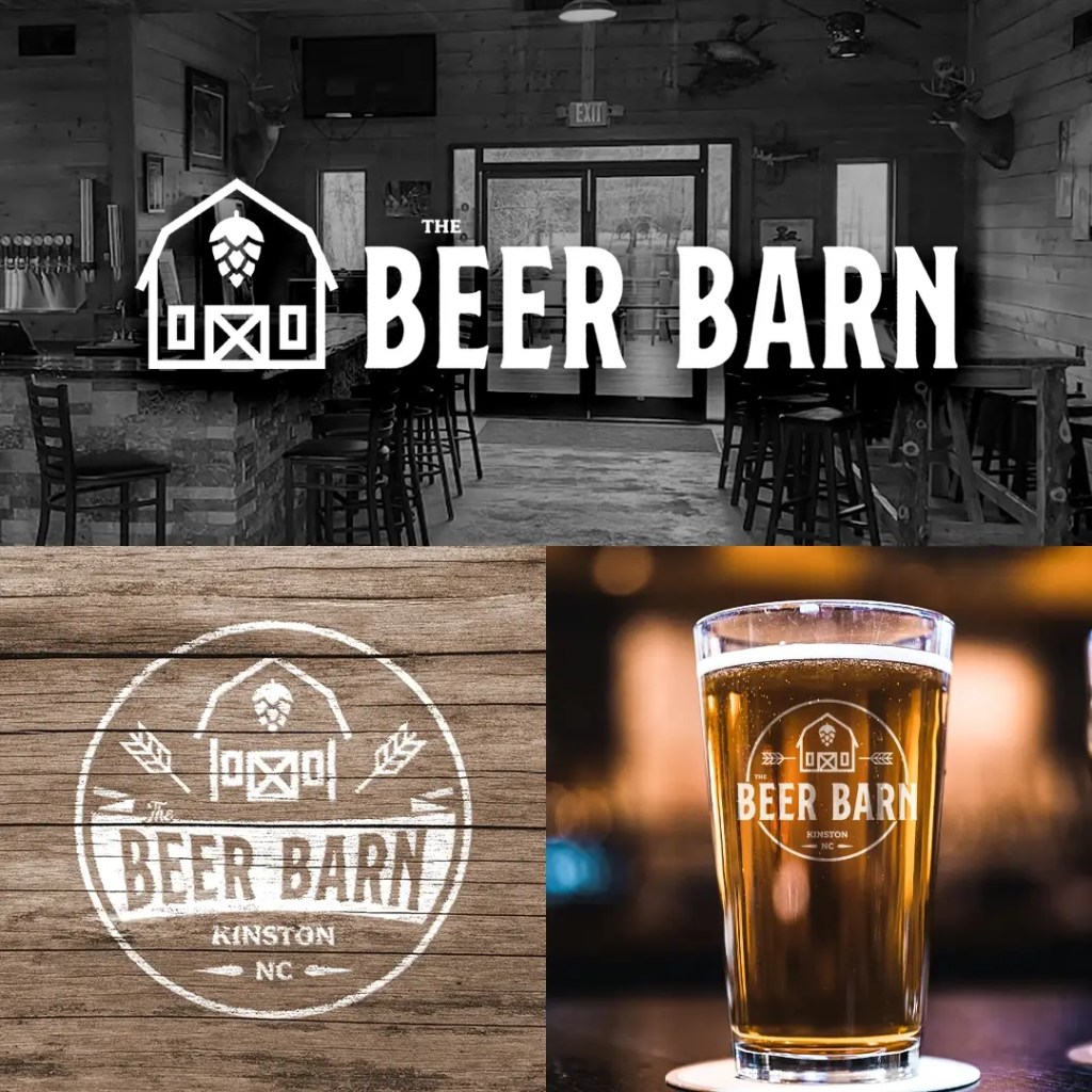
The Beer Barn came to us to refresh their brand without losing the personality that made them a community staple in Kinston, NC. We redesigned their visual identity to strike a balance between a professional craft establishment and a laid-back local hangout.
By creating a comprehensive system of primary and alternative logos, we ensured the brand remains cohesive and recognizable across a wide range of marketing materials, merchandise, and digital platforms.
The Identity
The challenge was to build a brand that felt high-end and precise without losing its connection to the rustic, welcoming atmosphere of the barn. We wanted a look that was as strong as their local presence, mirroring the craft quality of their selection.
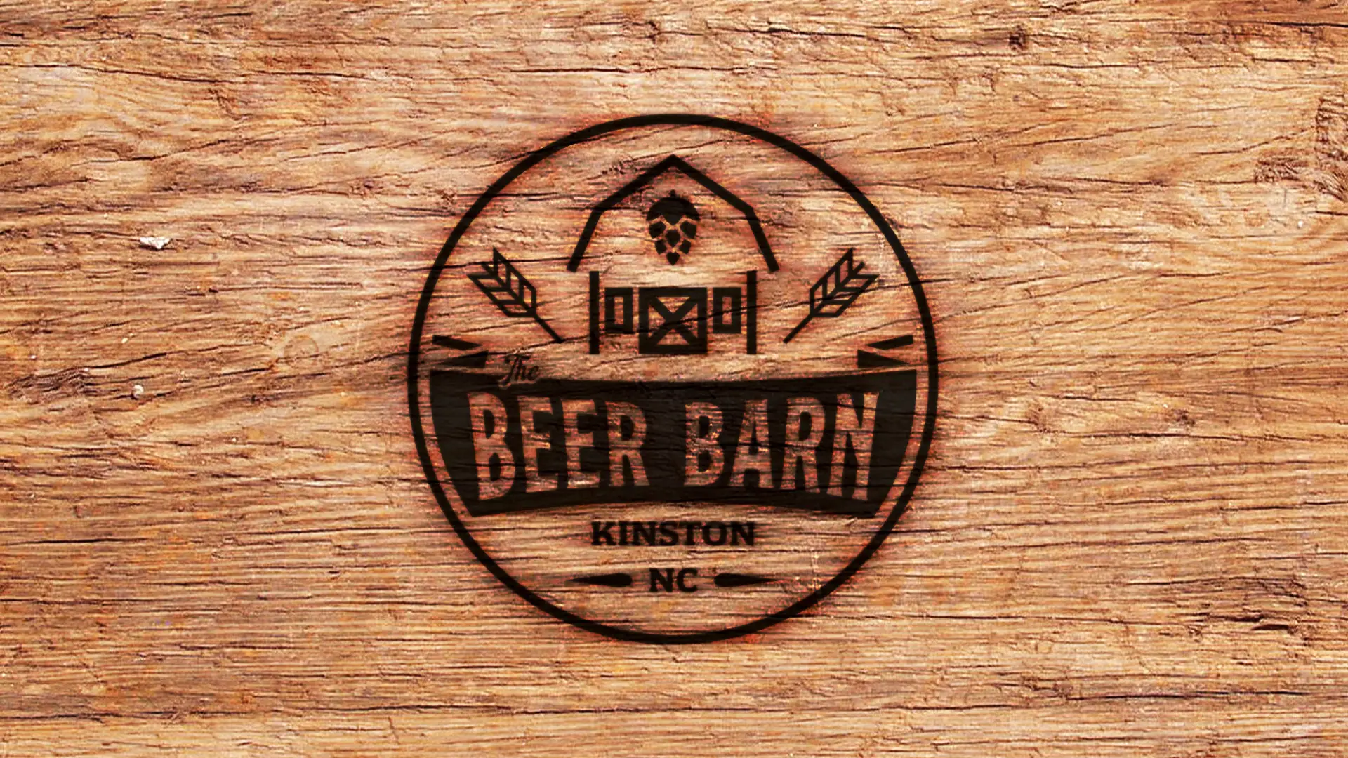
We leaned into a modern-industrial style, using a bold, condensed serif for the wordmark to give the brand a grounded, authoritative presence. The intentional use of badge-style framing and circular seals allows the brand to function as a “mark of quality” on physical products.
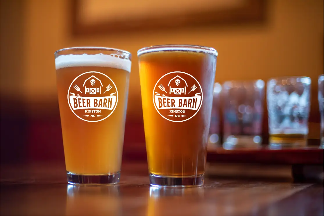
The custom iconography provides a direct nod to the location and industry, incorporating barn silhouettes, hop emblems, and wheat stalks into a clean, technical frame. This ensures the brand remains industry-appropriate while offering the versatility needed for diverse applications like etched glassware, embroidered hats, and printed apparel.
Brand Specifications
Main Typeface: SS Nickson One – Regular
Secondary Typeface: Montheim – Regular
Accent Typeface: Fairplex Wide OT – Medium
Color Palette:
Onyx Black: #000000
Pristine White: #FFFFFF