Web Design & Development
Logo Design & Branding
Web Hosting & Maintenance
Client
Watarigarasu
E-Commerce Store Website & Branding
The Project
Watarigarasu is a Japanese-inspired apparel label built end to end at Apex, from the name and the mark to the store that sells it. The brief was the one we hear most from apparel and e-commerce clients: simple, minimal, and fast, with a store that looks nothing like a template shop.
The build had three jobs. Give the brand an identity that leads with the kanji and lets everything else stay quiet. Build a WooCommerce store where every element, from the hero to the checkout, belongs to this brand and nothing looks stock. And do it on a platform that runs itself: print-on-demand fulfillment, live shipping rates, express checkout, newsletter, and consent, all working from day one. We built it on WordPress with WooCommerce and two custom plugin kits, one reusable for any e-commerce client and one made only for this brand.
What We Built
The store runs on two layers: a reusable commerce kit that handles the shop mechanics, and a site kit built only for Watarigarasu that handles the atmosphere. Here is what visitors get.
Feather hero. The home page opens on a canvas-drawn feather engine using the brand’s own feather artwork, with a wind-driven curtain reveal for the wordmark, headline, featured product, and call to action. Everything in the hero is one widget with its own controls.
Ambient feathers. Feathers drift across every page of the site, handed off from the hero so the effect never restarts. Distribution is adjustable from a settings page, with a per-page exclusion list for pages that need to stay still.
Brush-stroke hover. Buttons and links respond with an ink stroke instead of a color swap. The system is shared across the whole site so the same gesture appears on a nav link, a product card, and the add-to-cart button.
Kanji-mask product cards. A card variant that reveals product imagery through the brand’s kanji, used across carousels and the shop grid.
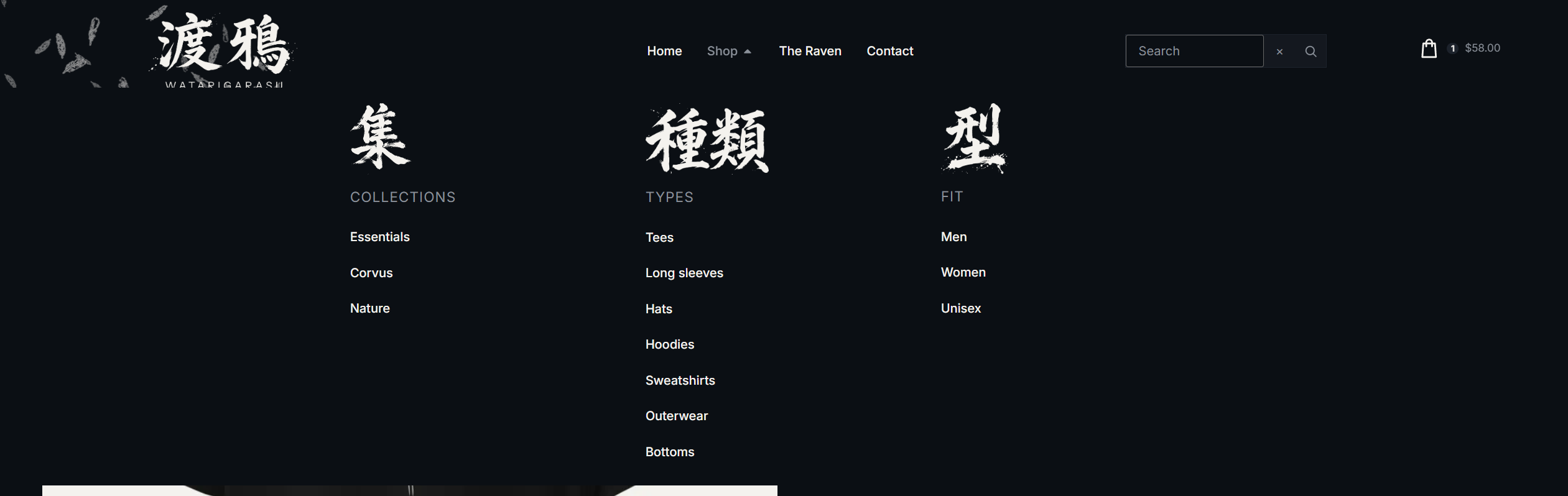
Catalog on three axes. Every product sits at exactly one point on Collections, Type, and Fit, each with its own archive and its own kanji heading. The Shop mega menu is those three columns, so a visitor filters by clicking a heading instead of learning a filter UI.
Shop grid and filter bar. Custom archive and filter widgets read whatever archive they sit on and render it in the brand’s card variants, so a collection page, a type page, and a fit page all share one layout and one set of tokens.
Cart, checkout, and account on brand tokens. A base stylesheet restyles cart, checkout, mini-cart, notices, and forms from the same color and type tokens as the rest of the site. Express checkout is on, so a returning customer pays in one step.
Fulfillment and shipping. Print-on-demand fulfillment is integrated directly, with live carrier rates at checkout and a free-shipping threshold, US shipping at launch.
Mockup recolor. An admin tool that recolors product mockups from the media library, one image at a time, so black garments and white garments both sit correctly on a dark store. Originals stay untouched with a one-click revert.
Newsletter, consent, and feeds. Newsletter signup with a welcome offer, a consent banner with Consent Mode, and a product feed to Google Merchant Center, all live at launch.
The Identity
The kanji is the brand. The wordmark sets 渡鴉 large with “watarigarasu” in lowercase beneath it as a caption, never a headline, and ships in three versions: a full mark with ink splatter for hero and back prints, a clean mark for the header, avatar, and neck label, and a simplified mark for the favicon and anything under 32 pixels.
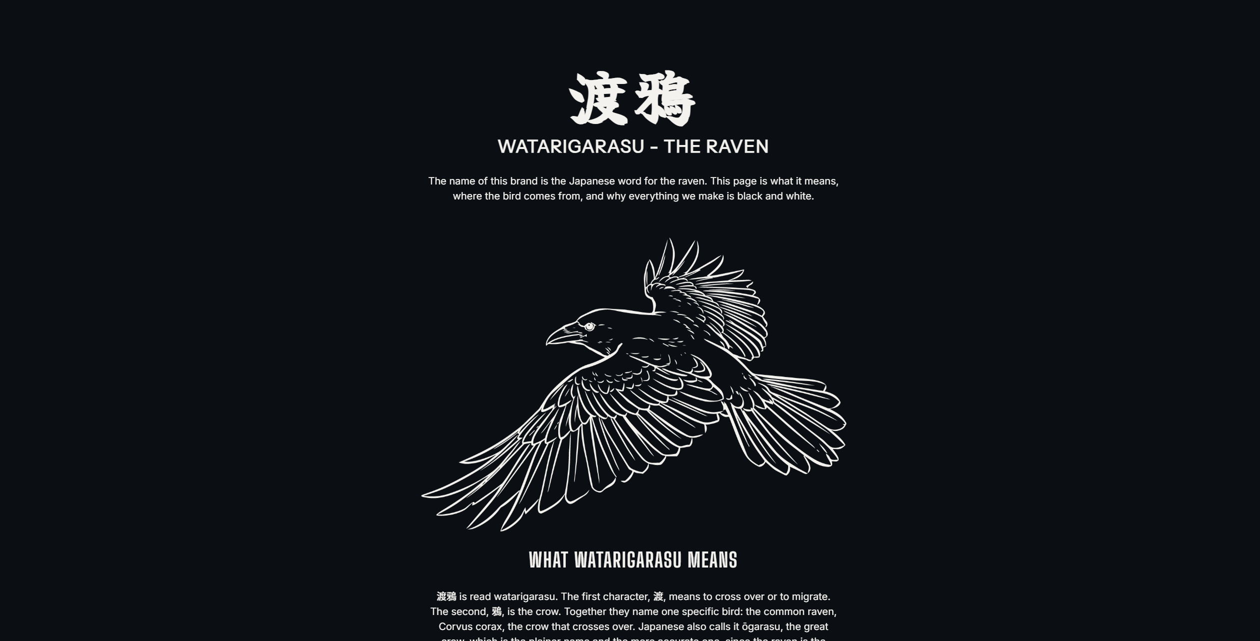
Two marks support it. A single-line raven stands on its own as the primary symbol, and a feather extracted from that raven serves as the secondary mark, locking up with the kanji where a lockup is needed. On garments, the feather and clean kanji sit at the left chest and the raven runs center back.
The type system is three families and five weights. Instrument Sans carries the romaji and brand lines. Inter handles body and navigation. Big Shoulders Display sets headings, prices, and labels. The palette is a near-black scale with paper for text and ash for secondary text, and nothing else, so the black and white prints are the only contrast on the page.
Brand Specifications
- Wordmark: 渡鴉 with lowercase romaji caption, three versions (Full, Clean, Simplified)
- Marks: single-line raven (primary), feather (secondary)
- Romaji and Brand Lines: Instrument Sans Regular
- Body and Navigation: Inter Regular and Medium
- Headings, Prices, Labels: Big Shoulders Display Bold and Semibold
- Color Palette:
- Ink 900:
#0B0F14 - Ink 800:
#14181F - Ink 700:
#1C222B - Paper:
#F4F2EE - Ash:
#8A9099
- Ink 900:
Hosting and Maintenance
The store runs on managed WordPress hosting with the same care plan we offer every e-commerce client: updates, security, backups, and development hours each month. New products, collections, and drops go live from the editor without touching the build.